
A custom edge, considered from the start
Die-Cut Stickers
Turn the outside edge into part of the idea—not just the boundary around it.
A die-cut sticker is an individual piece whose backing and sticker follow a custom outer contour. The strongest results connect that silhouette to artwork that remains clear at its real size, then match the construction to the surface and setting where it may be used.
Plan from the surface backward. “Die-cut” identifies the individual custom contour; it does not automatically describe material, finish, water resistance, durability, or availability.

Build the contour into the plan
Make the outline part of the design
Treat the contour as a visible design decision. A recognizable silhouette can carry the idea before someone studies the artwork.
Include it as a branded extra
An individual piece can travel as a handout or accompany another item without relying on a shared backing sheet.
Apply to a clean, smooth surface
Check the actual surface first. Adhesion varies with texture, coating, cleanliness, moisture, movement, and the construction selected.
Give the artwork breathing room
Keep essential detail away from the edge and simplify delicate points. Material and finish decisions should follow the choices actually available.

Contour and scale
Let the outline do the talking.
A custom contour can make an abstract mark, illustration, mascot, or wordmark feel like a complete object. Decide whether a tight edge or a deliberate border supports the artwork best. A border can create breathing room and may simplify handling around detailed art; a tighter contour makes the silhouette more exacting.
Review the shape at true size. Fragile points, tiny holes, deep notches, and many sharp corners can become awkward to peel or easier to lift. Simplifying those areas often improves recognition without changing the core idea. Keep essential detail inside a safe area and extend any background art beyond the cut path as bleed, so normal alignment variation does not reveal an unintended unprinted edge.
Scale changes legibility. Fine strokes and small copy that look comfortable on a large monitor can feel crowded in hand. Test the artwork at its intended dimensions and prioritize clear contrast, deliberate negative space, and a silhouette that still reads from a normal viewing distance.
Artwork and application
From art file to a clean application.
For print-ready art, a clean, closed vector cut path gives the contour an unambiguous perimeter. Keep that path separate from visible artwork. Vector files are useful for logos and line art; raster images can work when they remain sharp at final size. Extend backgrounds through bleed, retain a safe area, and check fonts, linked images, transparency, and hidden layers before export.
Application starts with a compatible surface. Remove dust, grease, wax, moisture, and cleaner residue, testing any cleaner where surface sensitivity is uncertain. Measure and align before contact. For a small piece, begin at the center and smooth outward with overlapping pressure rather than dropping the entire adhesive face at once.
Care depends on the actual material, finish, adhesive, and environment. Avoid assuming that a custom contour also means water resistance or outdoor suitability. Test uncertain combinations, avoid aggressive scraping at the edge, and follow any guidance tied to the construction actually selected.

Format guide
Is die-cut the right format?
Choose an individual custom outline when the silhouette should be part of the handoff. A shared backing can make sets easier to organize, a conventional label can prioritize repeated information, and a larger decal-like application can shift attention toward surface planning and installation. These are use considerations—not promises that every format is currently configured.
| Format | How it is presented | Best when | Decision consideration |
|---|---|---|---|
| Die-cut sticker | An individual piece cut to a custom outer contour | The outline should be part of the presentation | Fine points, small openings, peeling, and handling |
| Kiss-cut or sheet format | One or more shapes remain on a larger shared backing | Organized sets or easier peeling are useful | The backing remains part of the handoff |
| Standard label | A familiar geometric format, often used repeatedly | Information and consistency matter more than silhouette | The shape may play a quieter role |
| Vinyl decal | A graphic considered for a larger or more placement-specific installation | The viewing area and surface drive the decision | Alignment, substrate, and installation become more important |
Preparation module
Before you submit or apply
- Confirm the usable surface is smooth, clean, dry, and suitable for the selected construction.
- Simplify fragile contours, hairline connections, tiny holes, and crowded interior notches.
- Provide a clean, closed vector cut path when submitting print-ready artwork.
- Extend background color or imagery beyond the cut path to create bleed.
- Keep text and essential artwork comfortably inside a safe area.
- Check that raster artwork remains sharp at its actual final size.
- Outline or package fonts and inspect linked images, transparency, and hidden layers.
- Measure the placement area and note nearby curves, seams, handles, or hardware.
- Clean and fully dry the surface, then align the piece before adhesive contact.
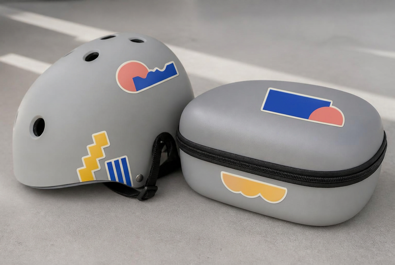
Surface shape, texture, movement, and care all matter. Confirm compatibility before treating a placement as permanent.
Buyer questions
Frequently asked questions
01
What makes a sticker die-cut?
A die-cut sticker is cut through the sticker layer and its backing along a custom outer contour. Each finished piece separates as an individual shape instead of remaining on a shared rectangular sheet.
02
Can my sticker be any shape?
The outline can be highly customized, but practical limits matter. Very thin points, tiny openings, and tightly packed details are more fragile and may be difficult to peel. A simplified contour or modest border often produces a cleaner, sturdier result.
03
Do I need to provide a cut line?
If you are supplying print-ready artwork, a closed vector cut path is the clearest way to communicate the intended shape. If a design service creates the contour, review the proof carefully to confirm that the resulting edge matches your intent.
04
Why is bleed needed on a die-cut sticker?
Bleed extends printed color beyond the intended cut edge. Because printing and cutting are separate aligned steps, bleed helps prevent a narrow unprinted gap if the cut varies slightly from the artwork.
05
Is vinyl always the right material?
No. Vinyl film is a versatile choice for many handled or occasionally damp applications, while paper may suit short-term indoor use or a paper-specific appearance.
06
Are die-cut stickers waterproof?
Water resistance depends on the material, ink, finish, and construction—not on the die-cut shape itself. A suitable film and protective layer may handle incidental moisture well, but repeated washing, immersion, chemicals, and outdoor exposure require a material selected for those conditions.
07
What surfaces should I avoid?
Avoid dusty, greasy, wet, porous, heavily textured, or flexible surfaces unless the adhesive and material are specifically intended for them. Rough masonry, unfinished wood, silicone, and surfaces coated with wax or release agents commonly create adhesion problems.
08
Should I choose die-cut or kiss-cut stickers?
Choose die-cut when each sticker should be a standalone piece with a finished custom outline. Choose kiss-cut when easy peeling, multiple designs, or a shared backing sheet is more useful. Neither format is inherently better; the handling requirement decides.
09
How do I prevent bubbles during application?
Clean and dry the surface, align before pressing, and apply gradually from the center outward with firm, overlapping strokes. For a larger piece, use a tape hinge and work in sections rather than dropping the entire adhesive surface at once.
10
Can small text and fine details be printed on a die-cut sticker?
They can be included, but readability depends on final size, contrast, font weight, and the cut’s proximity to the detail. Review the design at actual size and simplify elements that become crowded, fragile, or difficult to read.