Neighborhood services
Introduce a relevant service to a defined local area.
Print Materials
Put a clear local message at the door—where an offer, reminder, or introduction has a chance to be noticed in the moment.
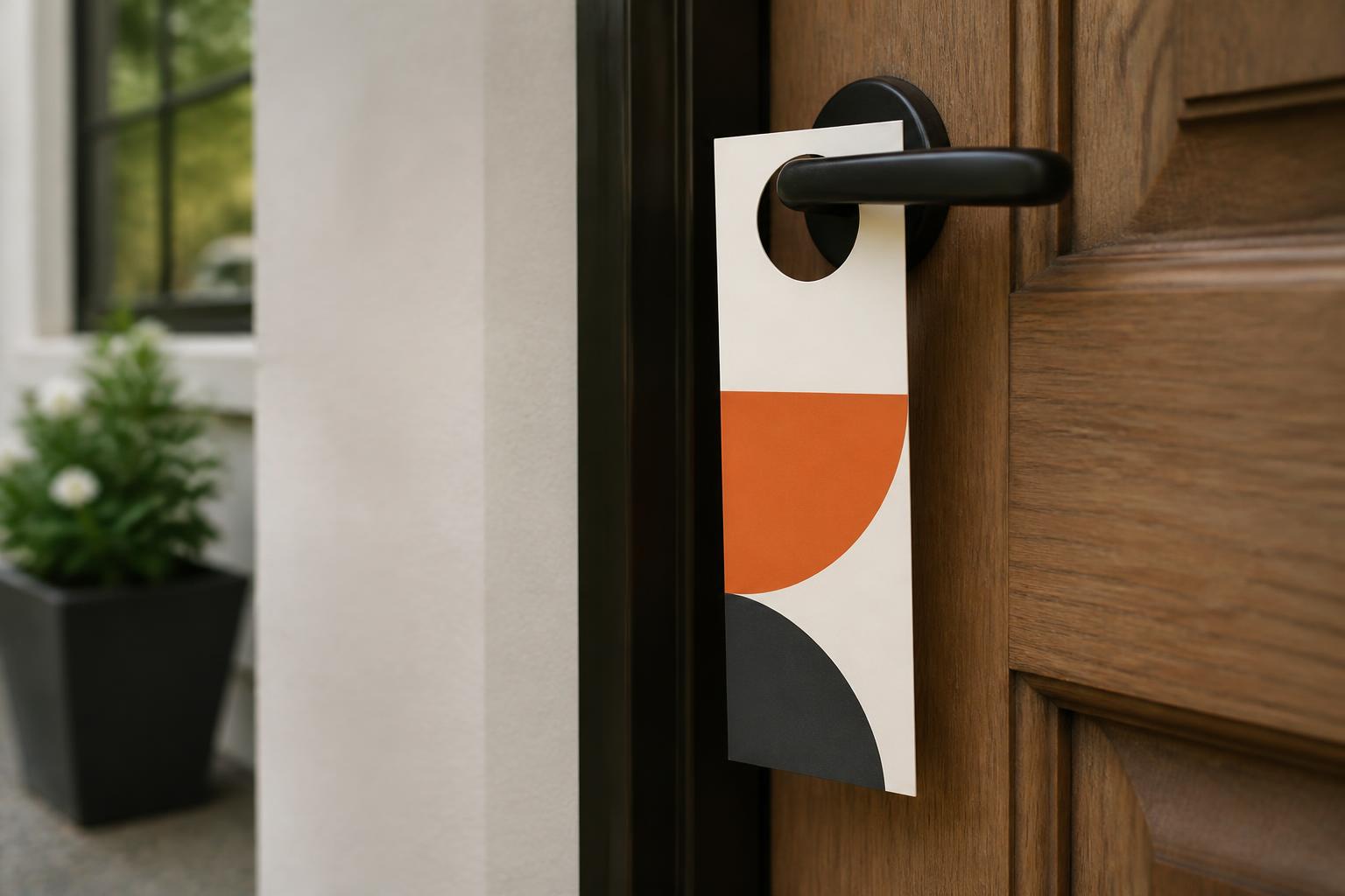
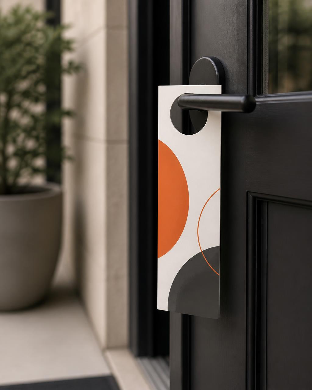
Door Hangers give neighborhood outreach a physical presence. Lead with one reason to care, make the next step easy to find, and use the reverse side for the details that support the decision when the live product options make that approach appropriate.
A focused format for nearby homes, rooms, entries, and events.
Give a service, invitation, offer, or reminder room to be understood quickly.
Use the available product choices and artwork guidance to match the job.
Introduce a relevant service to a defined local area.
Share a clear notice or useful next step at an entry.
Bring an event, menu, or local moment closer to its audience.
Pair a visual announcement with details people can keep or scan.
First impression
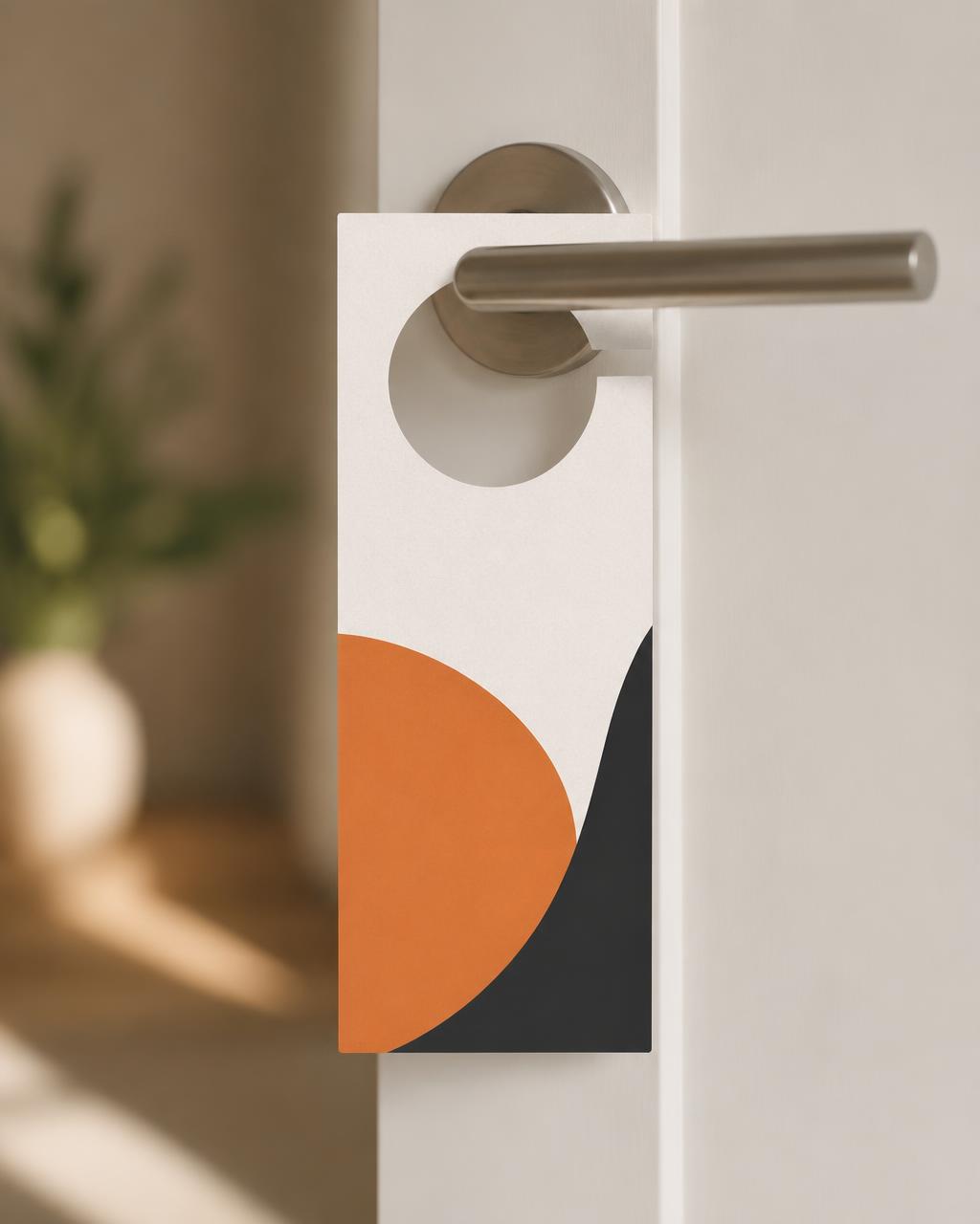
At an entryway, attention is brief. Let the front carry a single idea: what this is, why it matters, and what the reader should do next. Let the other side earn its space with the supporting details, such as services, a short menu, an event detail, or a second response path.
Use the template and file guidance shown for the selected live product option before finalizing artwork.
Decision guide
The right selection begins with what the reader needs to understand at the door. Use the live product selector as the source of truth for formats and options currently offered. The guidance below helps you decide among options only when they appear there.
If selector presents more than one format, a short message can suit a compact choice. Choose a roomier displayed format when the design needs headline, image, details, and clear response path without crowding.
When side selection is offered, front-only artwork can keep a brief message focused. Use two sides only when the live option supports it and the reverse has a real job to do, such as details, instructions, or a second call to action.
Choose only among surfaces or finishes shown in current selector. If handwriting matters, reserve a test area and confirm selected surface works with intended pen before relying on it.
If a perforation or detachable treatment is visible as an option, it can help separate a reminder, contact detail, or offer. Build important information clear of cut, slit, trim, and any displayed perforation location.
Start with number of permitted entries or planned placements, then include a sensible campaign allowance. Confirm property permissions and local rules before distribution.
| If you need to… | Door Hangers | Flyer | Postcard or direct-mail piece |
|---|---|---|---|
| Put a message at a specific entry | A door-ready format meant to hang at the entry. | Better suited to handouts, counters, or broader leave-behind use. | Better suited to postal or addressed distribution plan. |
| Make a quick local introduction | Lead with one direct reason to respond, then place details on the other side when appropriate. | Give a flexible page for a handout-style message. | Build around mailing-format and addressing needs. |
| Give people something to retain | Consider a visible live option supporting detachable reminder only if offered. | Use a simple handout people may carry or display. | Use mail format for take-home message. |
| Plan distribution | Confirm entry access, property permission, and local restrictions before placing. | Plan where handouts may be shared or displayed. | Plan for relevant mailing and addressing requirements. |
Choose based on moment of delivery, amount of information needed, and permissions that apply—not on a generic ranking.
Useful by design
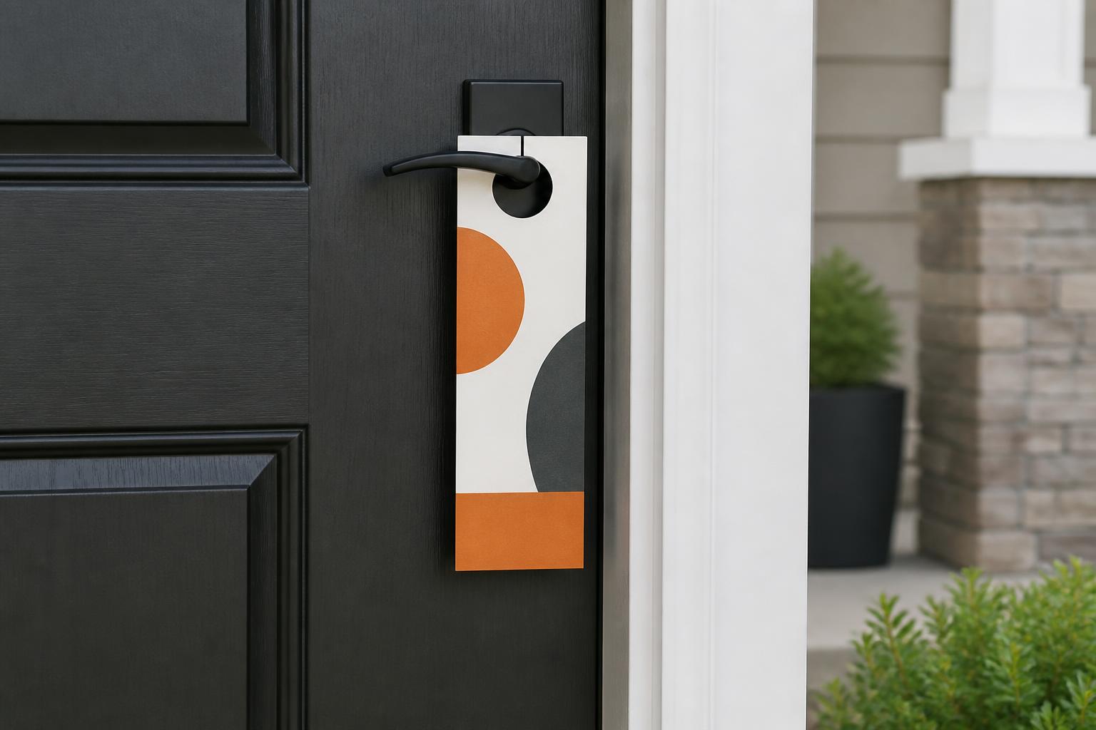
Door Hangers work best when the offer feels specific to the neighborhood or situation. A seasonal service reminder, opening invitation, room notice, or listing announcement is easier to understand when it names the action rather than asking reader to decode a crowded design.
Keep essentials easy to find. A relevant headline, service area or event detail when applicable, one primary response path, and legible conditions give piece a more considered, trustworthy feel.
Give the first glance one job.
Use additional space for details only when it helps decision.
Respect property, avoid blocking hardware or safety features, and follow applicable local rules.
Artwork workflow
Confirm format, orientation, and displayed structural features before building layout.
When active workflow supplies template or setup guidance, use it to locate trim, bleed, safe area, and opening before placing essential content.
Use sharp imagery at its placed size, high contrast, and tested QR code with clear space and another contact path.
Use any review, preview, or proof step presented in live workflow to check contact details, both-side orientation where relevant, and clearance around cuts or openings.
Distribution
A thoughtful distribution plan protects the message and relationship with neighborhood. Place hanger only where permitted, keep it clear of locks, handles, cameras, peepholes, weather stripping, and safety notices, and avoid locations where moisture or wind could quickly damage it. For shared buildings, gated communities, or commercial properties, check with appropriate manager or owner first.
Local and property rules vary. Confirm requirements that apply to your route before distributing.
Use one primary message, one supporting point, and one obvious action. If headline, contact method, and reason to respond cannot be understood at a glance, simplify front and move secondary detail to reverse only when active option supports it.
Choose one side for short focused message. When live selector supports two-sided printing, use reverse for details, instructions, service list, or useful response path rather than repeating clutter.
Use setup guidance for selected option. Keep headlines, faces, logos, phone numbers, QR codes, and fine rules well clear of opening, slit, trim, and displayed perforation.
A QR code can be useful when it leads to mobile-friendly page with clear benefit. Give it surrounding space, test physical size, and include visible non-QR response.
Use only surfaces/finishes shown in selector. Decide based on look, handling, and whether writing may matter; if handwriting essential, test intended pen on selected surface.
Only plan detachable element if current selector explicitly shows perforation or comparable option. Keep primary message intact above structural area and use template/guidance to place content safely.
Do not assume a printed Door Hanger is permanent outdoor sign. Consider expected exposure and discuss active live product options with appropriate team if environment is central.
Confirm contact details and terms, pieces clean/undamaged, and planned route respects property permissions, resident requests, and applicable local rules.
Start with the one action that matters most, then use live product choices and setup guidance to shape a Door Hanger that fits the moment.