
A clean frame for a focused idea
Square Stickers
Give a centered mark or concise message an orderly format that is easy to align and repeat.
Four equal sides create a dependable visual frame for simple artwork, short information, and coordinated placement. Start with the panel and viewing distance, then select only from the materials, adhesives, and finishes currently shown for the product.
Plan from the surface backward. A square describes the format—not its material, adhesive, finish, durability, removal behavior, or suitability for a particular environment.
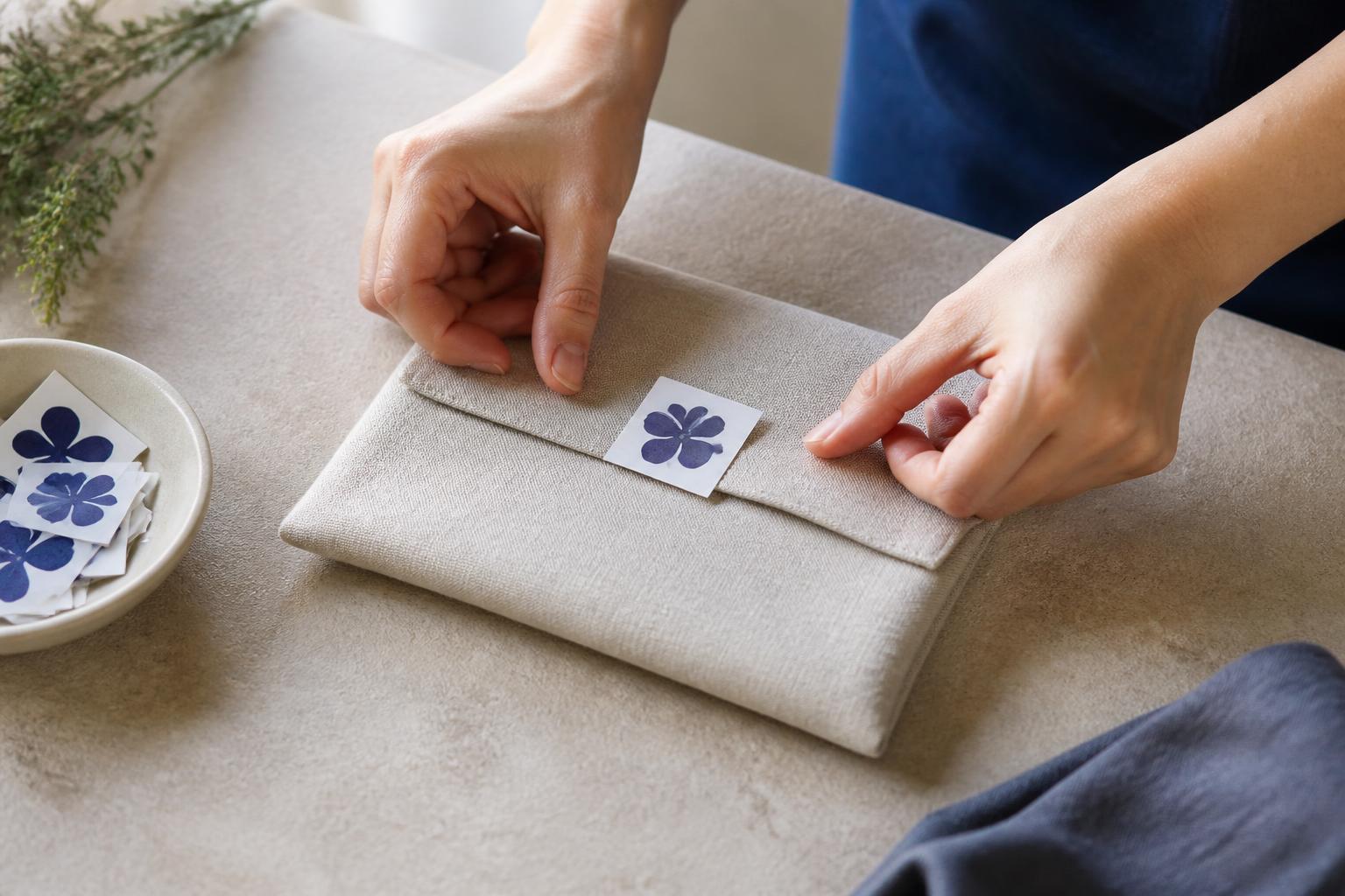
Keep each small placement intentional
Center the brand mark
A balanced square gives a centered symbol or compact identity a clear frame with even visual weight on every side.
Build neat repetition
Straight edges make repeated placement easier to judge across notebooks, broad panels, event pieces, or grouped items.
Keep the message short
A design-led panel works best when one mark, brief line, or simple visual has room to remain readable at final size.
Match the setting first
Choose only among the materials, adhesives, and finishes shown for the product, guided by the real surface and environment.
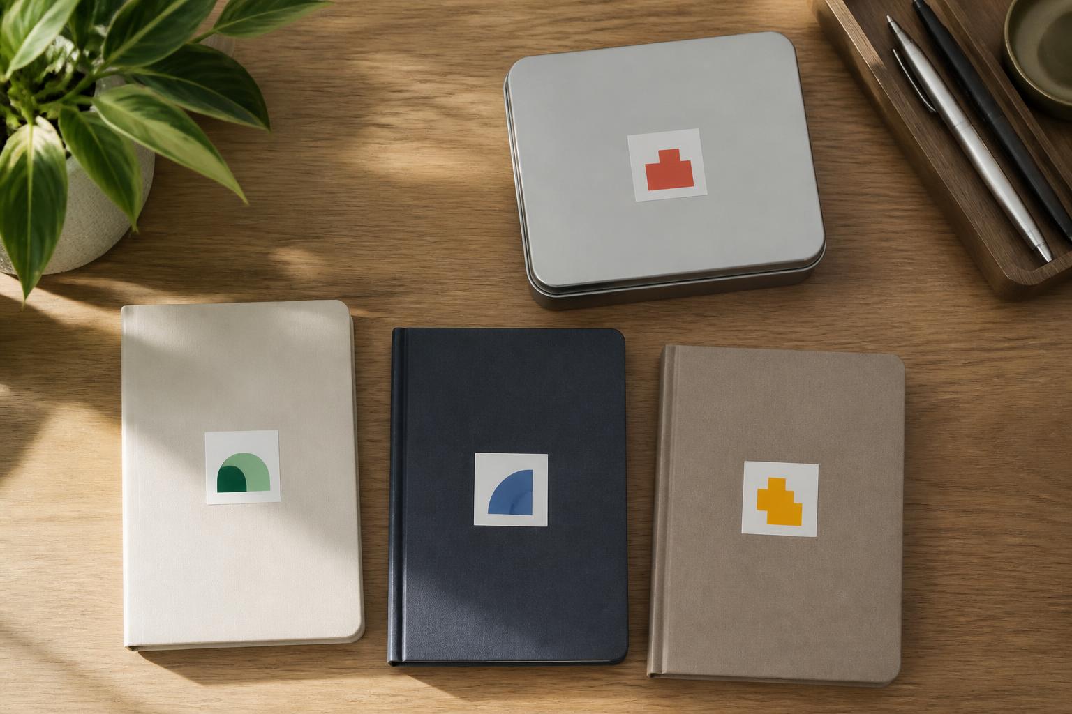
Composition and context
A small square that keeps the system looking sharp.
Centered composition and consistent edge clearance help each piece feel deliberate. Judge the panel at final size and at its normal reading distance. A mark that looks spacious on screen can become crowded when reduced, so protect contrast, readable scale, and a clear inner margin.
Straight sides make repeatable placement easier to compare, especially across a set of similar objects. Measure the usable panel rather than the object as a whole. Nearby seams, handles, ridges, or edges can shift the visual center and make the same placement feel inconsistent.
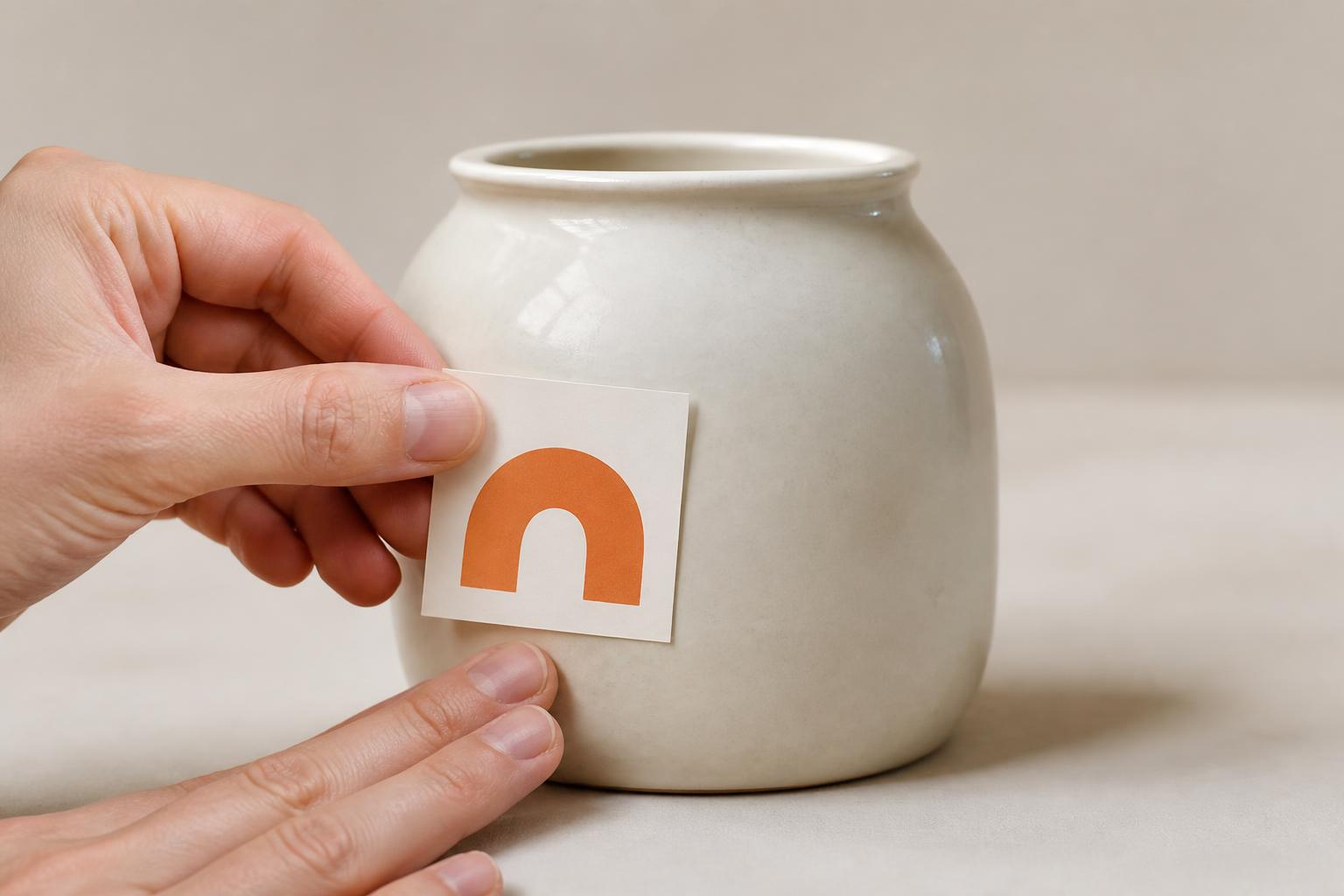
Curved surfaces need extra care because square corners can bridge, wrinkle, or lift when the sticker is large relative to the curve. Match the selected face material and adhesive to the actual surface and environment. For finishes, gloss may increase reflection and color energy, while matte can reduce glare; evaluate readability under the real lighting and choose only from available options.
Artwork and application
Plan the edge, then place with confidence.
Build the file at its intended square proportion. Extend backgrounds beyond the trim as bleed, while keeping type, logos, borders, and other critical detail within a separate safe area. Use clean vector artwork for marks and type where practical, and inspect raster images, fonts, transparency, spelling, and URLs at final size.
A QR code can be considered as part of the artwork, but it needs adequate contrast, a clear surrounding margin, and testing at the intended physical size and reading distance. Its presence does not guarantee scan performance in every finish, light, curve, or device context.
Before applying, confirm alignment and clean the surface with a method that is safe for that substrate. Let it dry fully, begin at one edge, and smooth the sticker down gradually rather than dropping the whole adhesive face at once. Care and removal depend on the selected construction and surface; avoid abrasive cleaning, forceful scraping, or untested solvents, and test delicate or unfamiliar finishes first.
Format guide
Which format fits the job?
Match the format to how the artwork should read and how each piece will be handled. These are planning considerations, not confirmation that every format is currently configured or available.
Square and aligned
Useful when a centered composition and straight-edge placement support the design.
Round and badge-like
Worth considering when a circular mark or softer perimeter is more natural for the artwork.
Custom contour
Puts more emphasis on the silhouette when the outer shape is part of the visual idea.
Sheet or roll handling
May suit grouped designs or repeated application when that presentation is available in the current product setup.
Transfer-style placement
Can suit selected graphics intended to appear without a visible background, subject to the available construction.
| Option | Best when | Key visual/handling advantage | Placement consideration |
|---|---|---|---|
| Square sticker | A centered or geometric design belongs on a defined panel | Straight edges create a clear frame and make repeated alignment easier to judge | Allow for corners, nearby edges, curvature, and a comfortable inner margin |
| Round sticker | A circular mark or badge-like appearance supports the design | A continuous perimeter has no corners to visually align | Long copy and rectangular artwork may need more space than the shape allows |
| Custom die-cut | The artwork silhouette should become the finished outer edge | The contour can reinforce recognition before the interior detail is read | Fine points, tight notches, and intricate edges can affect handling |
| Kiss-cut sheet | Several designs need to stay grouped on a shared backing | The sheet can organize small pieces and make individual shapes easier to peel | The backing remains part of the presentation and handoff |
| Roll label | The same design is applied repeatedly in an ongoing process | Continuous presentation can support consistent handling | Roll direction, winding, and dispensing method need to match the application |
| Transfer decal | Selected graphics should appear without a visible sticker background | The result can have a clean, sign-like visual presence | Alignment, surface compatibility, application, and removal can be more technique-sensitive |
Preparation module
Before you send art or start applying
- Confirm the intended final size and review the artwork at that exact scale.
- Keep type, logos, borders, and other essential content within a comfortable inner margin.
- Extend background color, photographs, or patterns beyond the intended trim as bleed.
- Use clean source art; check image sharpness, fonts, linked elements, and transparency.
- Review contrast, spelling, URLs, and code readability where a code is relevant to the design.
- Measure the usable surface and account for edges, seams, texture, and curvature.
- Match the selected construction to the expected indoor, outdoor, dry, damp, or handled setting.
- Clean and fully dry the surface, align before contact, and apply gradually from one edge.
- Test an unfamiliar surface, exposure, cleaner, pen, or removal requirement before wider use.
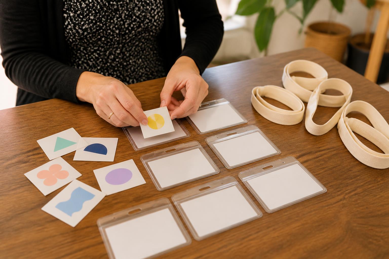
Repeated pieces look more consistent when size, edge clearance, orientation, and placement are decided before the first application.
Buyer questions
Frequently asked questions
01
What are square stickers commonly used for?
They are commonly used for package seals, logo handouts, product and inventory identification, event materials, envelope closures, mailers, notebooks, and branded promotional details. Their balanced shape works particularly well with centered artwork and short blocks of information.
02
Should I choose paper or vinyl?
Choose paper for many dry, indoor, lower-wear applications where its familiar feel and easy handling are useful. Choose vinyl when moisture, outdoor exposure, flexibility, or heavier handling is expected. The exact face, adhesive, finish, and environment still determine performance, so test an unfamiliar application.
03
Is a square sticker suitable for a QR code?
Yes, provided the code is printed with adequate contrast, a clear margin around it, and enough physical size for the intended scanner and viewing distance. Keep it away from the trim edge, avoid busy backgrounds behind it, and scan a final-size sample before distributing it.
04
What does bleed mean for sticker artwork?
Bleed is extra background artwork extending beyond the intended trim line. It allows the printed background to reach the edge even if the cut shifts slightly. Important type, logos, and other critical details should remain inside a separate safe area.
05
Can I put a square sticker on a curved container?
You can, if the area is broad and gently curved relative to the sticker size. A square placed over a tight curve may wrinkle or leave lifted corners. Measure the usable panel and test one sticker before applying a full batch.
06
How should I prepare the surface?
Remove dust, oil, grease, wax, and moisture, then let the surface dry completely. A smooth, room-temperature surface generally gives adhesive a better opportunity to bond. Confirm that any cleaner is safe for the substrate and test delicate finishes first.
07
How do matte and gloss finishes differ?
Gloss reflects more light and can make colors feel vivid, while matte reduces glare and often feels more understated. Select based on the viewing light, the amount of small text, the desired brand character, and how the sticker will be handled.
08
Can I write on a square sticker?
Writing depends on the face material and coating. Uncoated or suitably matte surfaces are generally more compatible with handwriting than slick gloss surfaces, but ink type and drying time matter. Test the actual pen or marker before labeling a large set.
09
How do I prevent bubbles and crooked placement?
Align one edge first and apply gradually, pressing from the center outward with clean fingers or a flexible card. Keep the adhesive free of dust, and avoid peeling and repositioning repeatedly. For a large application, use a test piece first.
10
How should I remove a square sticker?
Removal depends on the adhesive, surface, age, and exposure. Peel slowly from a corner and use gentle warmth only when it is safe for the substrate. Avoid aggressive solvents or scraping on painted, papered, printed, or delicate surfaces, and expect that some residue or surface change may remain.
Related formats
Compare the shape to the message
Die-Cut Stickers
Consider a custom outer contour when the silhouette is part of the artwork.
View productOval Stickers
Explore a softer geometric frame for a centered mark or concise message.
View productRectangular Stickers
Give longer information or a horizontal composition more room to breathe.
View product