
An efficient canvas for ordered information
Rectangular Stickers
Four straight sides make it easy to give a mark, a name, and one supporting line a clear hierarchy.
The rectangle is the format people already know how to read, which is exactly why it works so well for package panels, folders, mailers, equipment, and containers. Plan the panel and the reading distance first, then choose material, finish, and adhesive from the options shown for the product.
Format is not performance. The shape describes the outline only — not durability, water resistance, removability, or suitability for a specific surface, exposure, or requirement.
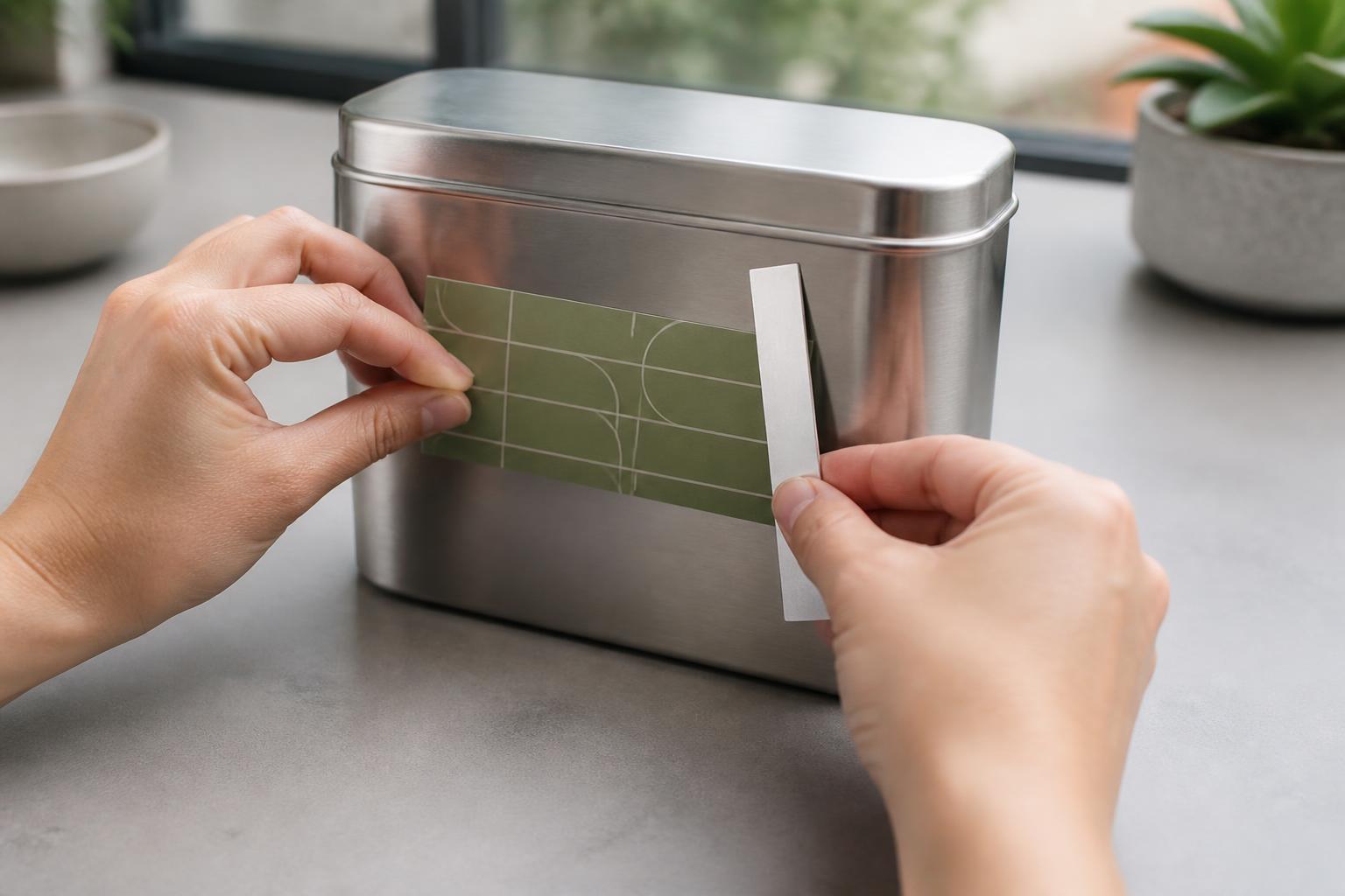
What to settle before you design
Give the message a reading order
Straight sides let a mark, a name, and one supporting line sit in a clear sequence instead of competing for the same space.
Repeat placement without guesswork
Parallel edges are easy to align across a row of boxes, folders, bins, or containers, so a set looks deliberate rather than approximate.
Pick the shape for the copy
When there is more than one thing to say, a rectangle holds it more comfortably than a contour cut built around a silhouette.
Read the surface first
Curvature, texture, moisture, handling, and how long the label needs to stay put should drive the choice among the options shown for the product.

Hierarchy and use
Room for the message that matters.
A rectangular sticker is a printed graphic trimmed to four straight sides and backed with pressure-sensitive adhesive that bonds under firm, even pressure. The shape earns its place when information needs a predictable order: a mark at one end, a product name or short instruction beside it, and a single supporting detail such as a variant or a web path. Keep that hierarchy to three levels at most and the label stays readable even when it is small.
Judge the layout at the size and distance people will actually read it. Give type a generous inner margin rather than pushing it toward the trim, protect contrast between the copy and the background, and let one element be clearly dominant. The same discipline is what makes repeated placement look intentional across a product line, a shelf of bins, a stack of folders, or a row of outgoing orders. Keep the label off seams, folds, zippers, corners, and openings, and treat safety-critical or regulated information as a separate requirement rather than something a decorative sticker covers.
Material, finish, and adhesive belong to the same decision. Paper suits indoor packaging, mailers, and short-term identification, and matte or uncoated faces are generally the easier ones to write on. Film handles frequent contact and incidental moisture better and follows a gentle curve more willingly, while clear faces let the substrate show through and can shift how pale colors read. Gloss lifts saturation but reflects more; metallic effects add emphasis and change how light tones appear. Removable adhesive is the sensible starting point for temporary indoor use, permanent adhesive for a lasting bond on a compatible surface, and higher tack for difficult plastics — at the cost of easy repositioning. Surface energy, texture, temperature, and coatings all influence the result, so where it matters, test the actual construction on the actual object and select only from what the product currently offers.
Artwork and application
A clean edge begins before application.
Build the file at finished size. Extend background color or imagery past the cut so a small trim variation never exposes a white sliver, and hold text, logos, and fine detail comfortably inside a safe area. A narrow border either needs to look deliberate or should give way to a background that runs to the edge. Use vector art for marks, type, and line work; when the art is raster, start from a high-resolution original at final size rather than a web image or a screenshot, and export with fonts embedded or converted. Screen color is emitted light and printed color is reflected, so favor contrast and legibility over chasing a monitor match. If a barcode or scannable code is part of the design, keep its clear margin, hold strong contrast, and test a same-size print with the intended scanner.
Apply to a smooth, dry, clean surface at moderate room temperature. Remove dust, oil, grease, wax, and cleaner residue with a method that is safe for the substrate, then let it dry completely. Avoid loose paint, heavy texture, dampness, seams, rivets, and sharp transitions unless the construction is intended for them.
Measure and mark the position before peeling. Expose part of the adhesive, anchor one edge, and press outward gradually with a clean card so air travels to the perimeter. Do not stretch the piece, touch the adhesive, or lift it repeatedly once bonding starts. Press the perimeter firmly and give the adhesive time to settle. Clean later with a soft cloth and a mild, compatible solution; avoid abrasives, sharp tools, strong solvents, and pressure washing. Removal can pull paint, leave residue, or reveal a color difference between covered and uncovered areas, so test first when the surface is delicate or unfamiliar.

Format guide
Choose the format by the information and the surface.
A rectangle panel wins when there is something to say and it has to stay orderly. A die-cut silhouette wins when the outline carries the idea. A sheet keeps grouped art together, a roll suits repeated application, paper leans indoor, decal-style constructions favor smooth surfaces, and a window format is specific to appropriate glass. These are planning considerations, not confirmation that every format is currently configured or available.
Rectangle panel
The dependable answer when information needs ordered space and predictable alignment.
Die-cut silhouette
Worth considering when the outline of the artwork is the point and copy is minimal.
Sheet of grouped art
Can suit several small designs kept together on one backing for hand placement.
Roll for repetition
May fit ongoing, repeated labeling where a consistent pace matters more than variety.
Paper, decal, or window
Paper leans indoor, decal-style constructions favor smooth surfaces, and window formats are specific to appropriate glass.
| Format | Best when needed | Primary advantage | Placement or use consideration |
|---|---|---|---|
| Rectangular sticker | A label, seal, or brand panel needs room for a mark plus copy | Efficient use of the full area and straightforward alignment | Corners can lift on dirty, textured, or sharply curved surfaces |
| Die-cut sticker | The outline should follow a logo or illustration | A strong custom silhouette that is recognized before it is read | Less predictable space for longer text |
| Sticker sheet | Several designs should stay together for hand application | Convenient organization and variety on one backing | Separating and placing each piece takes more handling |
| Label roll | The same label is applied repeatedly at a steady pace | Efficient for ongoing, consistent application | Roll direction and dispensing need to match the method used |
| Paper label | Indoor packaging or temporary identification is the job | Lightweight, familiar, and often easy to write on | Moisture and abrasion can shorten how long it stays presentable |
| Vinyl decal | A more robust graphic belongs on a smooth surface | Flexible and better suited to frequent handling | Surface preparation and careful placement matter more |
| Window cling | Temporary messaging belongs on suitable glass | Repositionable display without a conventional adhesive bond | Limited to appropriate smooth glass and viewing conditions |
Preparation module
Before you submit or apply
- Confirm the surface, exposure, handling, expected life, and removal needs before anything else.
- Choose only among the constructions and finishes shown for the product for that use.
- Test the material and adhesive on the actual substrate when adhesion matters.
- Measure the available panel and keep the label clear of folds, seams, corners, and hardware.
- Build artwork at finished size and hold vital content inside a generous safe area.
- Extend background color or imagery beyond the cut edge as bleed.
- Use high-resolution source art and inspect small type, thin rules, borders, and reversed text at actual size.
- Check contrast and test any barcode or code on a printed sample at final size.
- Clean and dry the surface, plan the alignment, and have a soft card ready before peeling.
- Store unused pieces flat and protected from heat, moisture, direct sun, and dust.
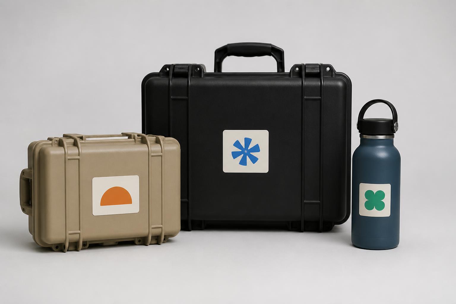
Consistent size and placement do most of the work when the same label has to appear across different objects.
Buyer questions
Frequently asked questions
01
What are rectangular stickers best used for?
They suit product labels, packaging seals, name labels, mailers, folders, equipment identification, event materials, and brand panels. The straight edges provide predictable space for a logo and concise information.
02
Should I choose paper or vinyl?
Choose paper for mainly indoor, dry applications where a lightweight or writable label is useful. Choose vinyl when the sticker will be handled frequently or may encounter incidental moisture. Surface and environment should make the final decision.
03
Are rectangular stickers suitable for outdoor use?
Some vinyl constructions are better suited to outdoor exposure than paper, but performance depends on the face material, ink, adhesive, sunlight, moisture, temperature, and surface. Treat outdoor use as a material-selection question and test the intended application when longevity matters.
04
Can I put one on a curved surface?
A gentle curve may work with a flexible material, but compound curves, sharp corners, and tapered objects can create wrinkles or lifting. Test a sample on the actual object before applying a large quantity.
05
What file type should I prepare?
A high-quality PDF is commonly practical, while vector artwork is valuable for logos and type. High-resolution PNG or JPG files can work when created at the final size. Avoid screenshots and small web images.
06
How much space should I leave around text?
Keep essential text and logos visibly inset from the trim. The smaller the sticker, the more generous the visual breathing room should be. Review the design at the size it will be read, not only while zoomed in.
07
Can I write on a rectangular sticker?
Matte and uncoated surfaces are generally easier to write on than glossy or reflective finishes. Test the actual pen or marker, allow ink to dry, and consider whether handling or moisture could smear the writing.
08
How do I apply one without bubbles?
Clean and dry the surface, mark the position, and expose the adhesive gradually while pressing from the center toward the edges. A clean plastic card or squeegee can help distribute pressure. Do not stretch the sticker.
09
Can I remove one cleanly?
Removal depends on adhesive type, dwell time, substrate, temperature, and surface condition. Removable adhesive is the better starting point for temporary use, but test first because paint, paper fibers, coatings, and residue respond differently.
10
Why do printed colors differ from my monitor?
Screens emit light, while printed stickers reflect it. Color mode, display calibration, material, finish, and ink coverage can all change the result. Prioritize contrast and legibility, and use a physical proof when a close match matters.
Related formats
Match the outline to the message
Square Stickers
Choose an even frame when a centered mark carries the design on its own.
View productOval Stickers
Soften the outline when one short message should read like a badge.
View productDie-Cut Stickers
Let the artwork silhouette become the finished edge of the piece.
View productReady to plan the label? Return to the Rectangular Stickers product details.