
A soft outline with a strong center
Oval Stickers
A balanced, rounded format for one short message or a single mark at the center.
The elongated curve gives a wordmark, product name, seal, or small illustration a badge-like presence without hard corners. Start with the panel it has to live on and the way people will read it, then work outward to material, finish, and placement.
Shape is not performance. An oval describes the outline only — not the face material, adhesive, finish, durability, removal behavior, or suitability for a particular surface or environment.
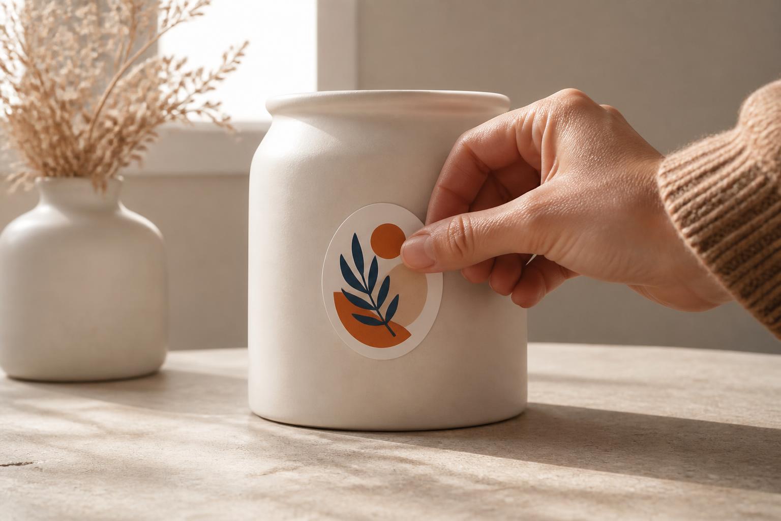
Four decisions that shape the result
Let the panel set the orientation
A horizontal oval follows a wide jar or box face; a vertical oval follows a bottle, pouch, or tall case. Decide the direction from the surface, not from the screen.
Keep critical art in the broad center
The ends of an oval taper quickly. Logos, product names, and anything that must be read belong in the wide middle where there is room to breathe.
Respect curves and edges
Seams, lids, handles, hinges, and tight tapers all change how an oval sits. Look for a broad, gently curved area before committing to a placement.
Match the setting, then choose
Moisture, sunlight, handling, and cleaning all matter. Select only among the face materials, adhesives, and finishes shown for the product for that setting.
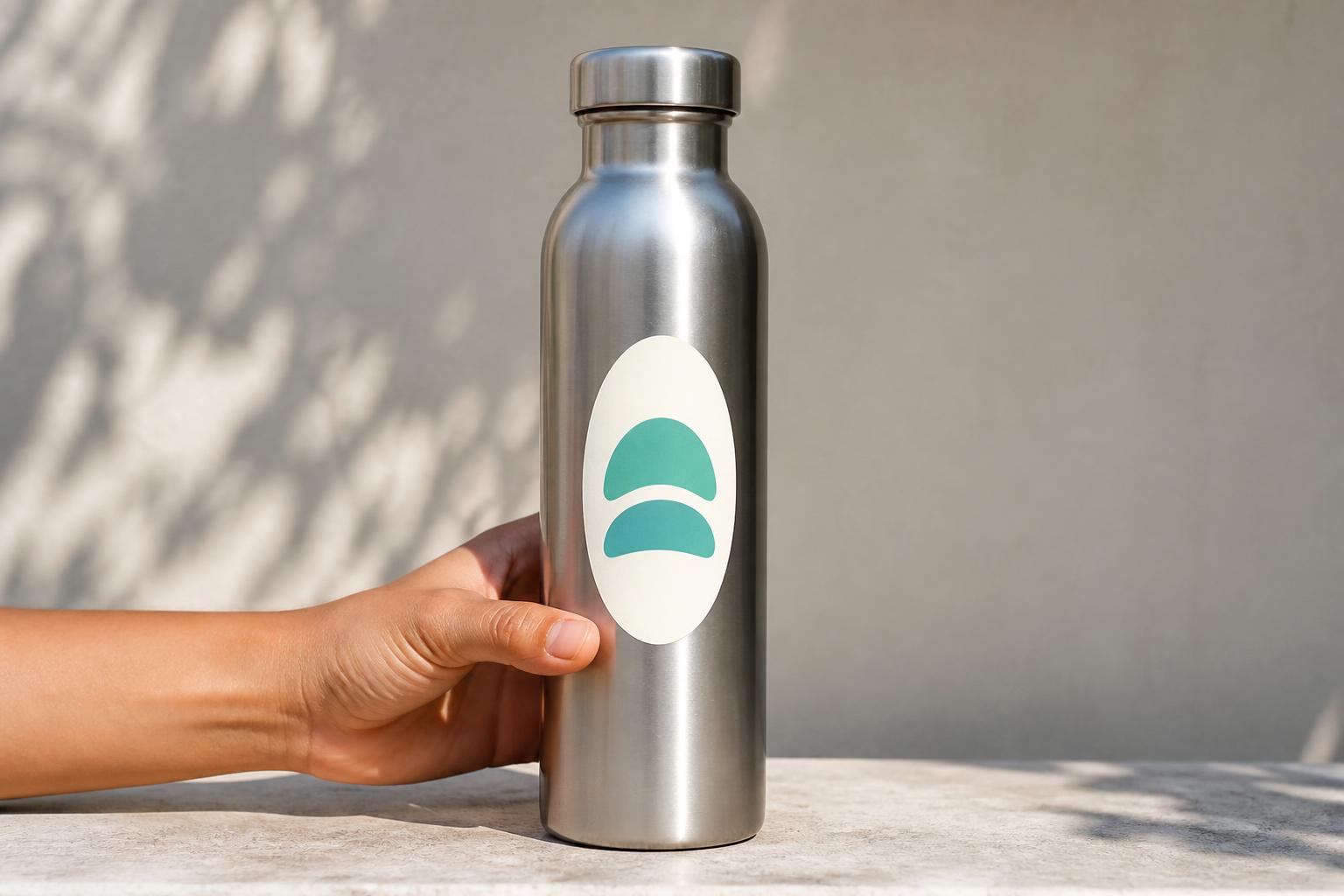
Shape, orientation, and placement
A softer shape with a clear focal point.
An oval sticker is a pressure-sensitive graphic trimmed to a rounded, elongated outline instead of a rectangle, circle, or custom contour. The build is usually a printed face, an adhesive layer, and a liner that protects the adhesive until it is applied. Pressure makes the bond; no separate glue, water, or heat is normally part of the process.
Horizontal layouts suit wordmarks, product names, and wide jar or box panels. Vertical layouts follow bottles, pouches, and tall cases, and they frame an emblem or stacked composition well. Either way, the widest part of the oval is the useful part: the ends taper, so a border that hugs the perimeter or a line of text pushed toward a point will read as crowded.
On real objects, look past the outline. Seams, lid rims, handles, hinges, and steep tapers all pull an oval out of alignment or create lift. Material and finish belong to the same decision: paper suits dry indoor handling, film handles splashes and more frequent contact, gloss lifts color intensity, and matte calms glare around small type. Choose among the options actually shown for the product, guided by the surface and the environment rather than the on-screen look alone.
Artwork and application
Give the curve room to work.
Build the file at the intended oval proportion and review it at true size. Extend background color, pattern, or imagery past the cut line as bleed so a small trim shift never exposes an unprinted sliver, and hold type, thin rules, and logo detail inside a comfortable safe area. Vector art keeps marks and lettering crisp; raster images should be supplied at the final dimensions rather than enlarged from a web file. Transparent areas need to be deliberate — an unprinted region shows the surface beneath it, not white.
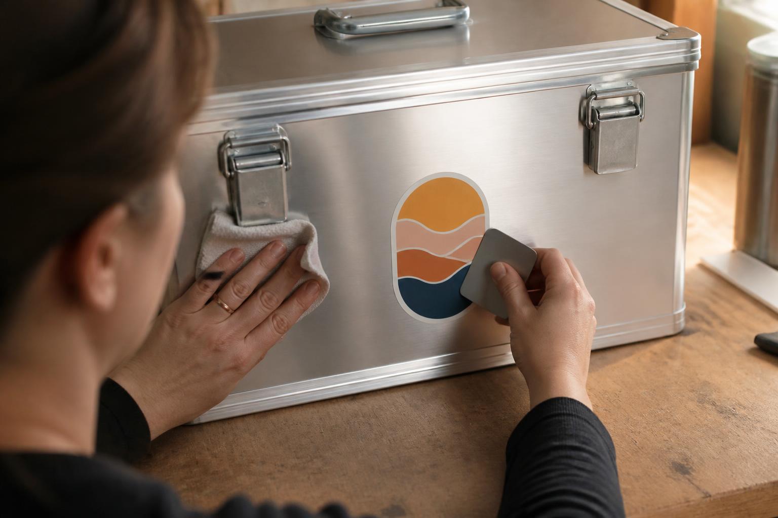
Before applying, wipe the surface with a clean lint-free cloth and a cleaner that is safe for that substrate, then let it dry completely. Wax, polish, oil, silicone, or fresh paint can all keep an adhesive from settling, and a painted surface should be fully cured. Work in moderate conditions rather than on something very cold, hot, damp, or sitting in direct sun.
Handle the sticker by its edges. Set the center down first, then smooth outward toward each end with even pressure so air travels to the perimeter instead of being trapped. On a curved container, follow the curve without stretching, and do not force an oval across a compound curve or a sharp taper. A clear face behaves differently on white board, colored plastic, metal, and glass, so test an unfamiliar substrate, cleaner, or exposure before committing a full batch.
Format guide
Choose the shape around the job.
An oval is the right answer when one idea sits at the center and the outline should feel calm. A rectangle carries dense information better, a circle favors a symmetrical emblem, a die-cut turns the artwork itself into the edge, a roll suits repeated application, and a window product is specific to appropriate glass. These are planning considerations, not confirmation that every format is currently configured or available.
Oval
A balanced badge shape when one mark or a short line should sit at the center of a soft outline.
Rectangle label
Worth considering when dense information needs to be arranged in blocks corner to corner.
Circle
Natural for a centered emblem or seal where symmetry does more work than width.
Custom die-cut
Puts the artwork silhouette on the outside when the contour is part of the idea itself.
Roll or window formats
Repeat application or glass-specific display can suit some jobs, subject to the constructions actually available.
| Option | Best fit | Design/handling advantage | Consideration |
|---|---|---|---|
| Oval sticker | A short message, product name, or center mark should read like a badge | The curved outline frames a broad central space with no hard corners | The pointed ends leave little room for long lines or a tight border |
| Rectangle label | Several lines of information need to sit in ordered blocks | Uses the full corner-to-corner area efficiently | Corners are the first thing to lift on curved or frequently handled items |
| Circle sticker | A centered emblem, icon, or seal carries the design | Symmetry reads quickly from any angle | Width is limited for horizontal wordmarks and product names |
| Custom die-cut | The outer contour of the artwork should become the finished shape | The silhouette is recognized before any interior detail is read | Irregular edges can complicate alignment and small type |
| Roll label | The same design is applied repeatedly in an ongoing process | Continuous presentation supports consistent, repeatable handling | Winding direction and dispensing need to match how pieces are applied |
| Window cling | A temporary, repositionable graphic belongs on suitable smooth glass | Intended for display without a conventional permanent bond | Not a general substitute for an adhesive label on packaging or equipment |
Preparation module
Before you submit or apply
- Confirm the orientation matches the available panel and the natural reading direction.
- Keep the logo, headline, and any essential wording inside the broad central area.
- Hold type, thin borders, and logo detail within a comfortable safe area away from the cut.
- Extend background color, pattern, or imagery past the intended trim as bleed.
- Review the layout at true size, not only enlarged on screen.
- Check color mode, transparency, outlined or embedded fonts, and image resolution before export.
- Use vector art for marks and line work; supply raster images at the intended output size.
- Clean the surface, let it dry fully, and confirm any paint or coating is cured.
- Avoid seams, lid edges, handles, hinges, tight tapers, and high-contact zones.
- Test a representative surface when the substrate, cleaner, paint, or exposure is uncertain.
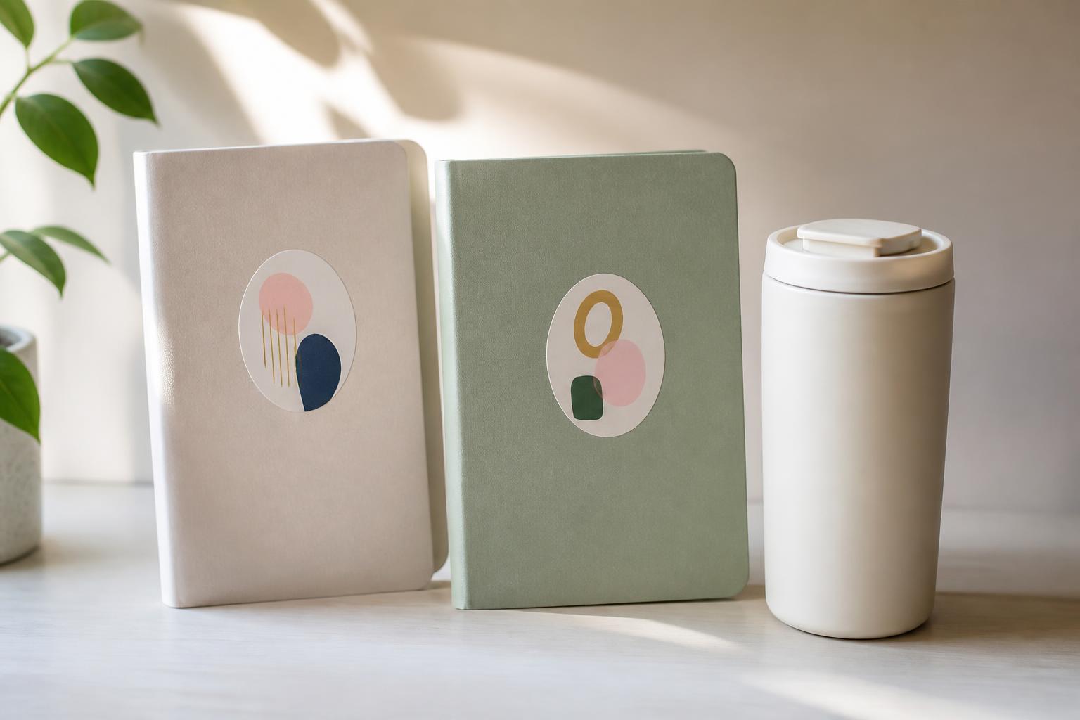
A set looks intentional when orientation, size, and edge clearance are settled before the first piece goes down.
Buyer questions
Frequently asked questions
01
What makes an oval sticker different from a regular label?
Its curved, elongated outline gives the design a badge-like presence while leaving a broad central area for a logo or short message. It is a shape choice, not a separate adhesive technology, so material and surface compatibility still determine performance.
02
Should I choose paper or film?
Choose paper for dry, indoor applications where a natural face and economical handling are useful. Choose film when the sticker may encounter splashes, condensation, frequent handling, or more demanding conditions. Match the face and finish to the environment rather than the appearance alone.
03
Can I use oval stickers on jars and bottles?
Yes, provided the surface is clean, dry, smooth, and compatible with the adhesive. Place the sticker on a relatively flat panel, align it with the container, and avoid seams, strong tapers, and compound curves that can create wrinkles or edge lift.
04
Are oval stickers suitable for outdoor use?
Some film constructions and protective finishes are intended for more demanding exposure, but suitability is material-specific. Consider sunlight, rain, temperature changes, abrasion, and cleaning chemicals, and avoid making an outdoor claim unless the selected construction supports it.
05
How do I design artwork for the curved edge?
Extend the background beyond the cut line for bleed and keep critical content comfortably inside the safe zone. Avoid thin borders that closely follow the perimeter, and keep important words in the wider middle rather than near the pointed ends.
06
What file format should I submit?
A properly sized PDF with embedded or outlined type is often a strong choice for logos and print layouts. High-resolution PNG files can be useful when transparency is required. The important factors are correct dimensions, sufficient resolution, clean transparency, and preserved color information.
07
Why does a clear sticker look different on different products?
Clear areas reveal the surface below, so the same ink can appear different on white cardboard, colored plastic, metal, or glass. If you need consistent color and opacity, an opaque white face is usually easier to predict than a transparent one.
08
How can I prevent bubbles during application?
Clean and dry the surface, avoid touching the adhesive, and apply the sticker gradually from the center toward the edges with even pressure. Curves should be handled without stretching. Large or highly curved placements may require an installation method suited to that specific material.
09
Can I remove an oval sticker later?
Removal depends on the adhesive, dwell time, surface, heat, and exposure. Lift a corner slowly rather than pulling sharply, and use a surface-compatible residue remover only after testing it in an inconspicuous area. Removal can affect paint, coatings, paperboard, or unfinished materials.
10
How do I choose horizontal or vertical orientation?
Let the placement and artwork lead. Use horizontal orientation for wordmarks, product names, and wide panels; use vertical orientation when the container or emblem has a taller visual flow. View a true-size mockup on the intended surface before finalizing the layout.
Related formats
Compare the outline to the message
Die-Cut Stickers
Consider a custom outer contour when the silhouette itself carries the artwork.
View productSquare Stickers
Choose an orderly geometric frame when repeated, aligned placement matters.
View productRectangular Stickers
Give longer information or a horizontal composition more usable room.
View productReady to plan the layout? Return to the Oval Stickers product details.