
Office branding with dimension
Dimensional Office Signage
Give your first impression a physical presence.
Raised letters, logos, and symbols can bring depth, shadow, and a more considered sense of place to an arrival wall, a conference room, or a shared workspace. Start with the story the space needs to tell, then let proportion, contrast, and wall conditions guide the decisions.
Designed around the wall, the viewing distance, and the role the sign needs to play.
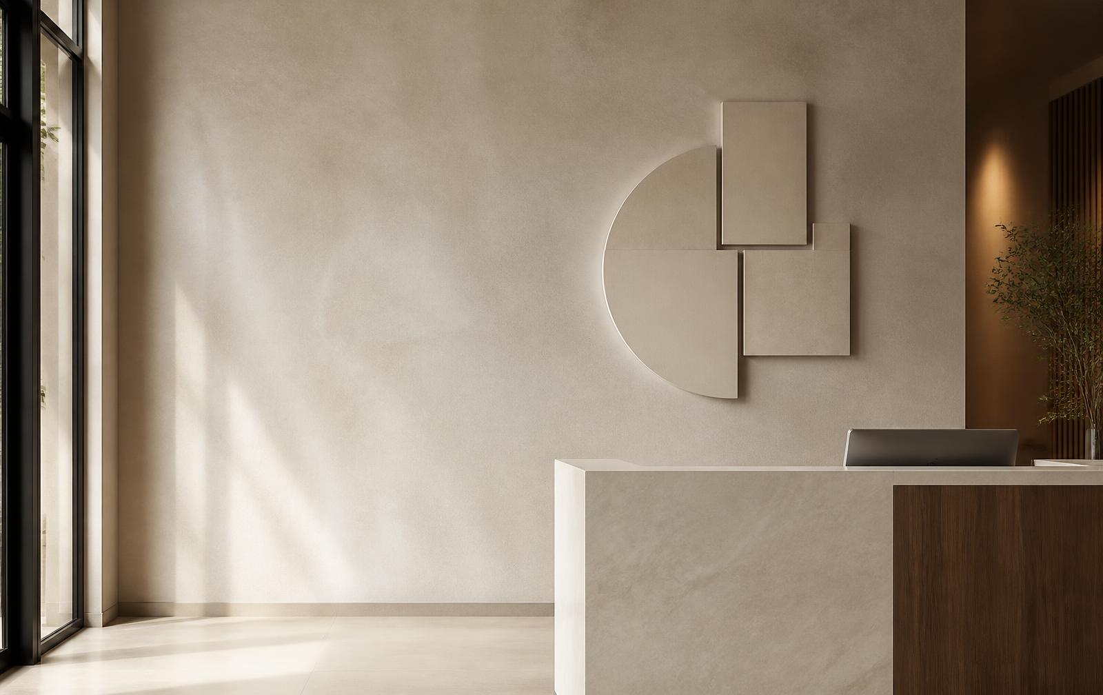
Built for the moments visitors remember
Reception walls
Create a clear visual arrival point for a name, a logo, or a symbol.
Conference rooms
Give shared spaces a composed identity without crowding the room.
Team spaces
Bring a sense of belonging to employee areas and culture walls.
Office corridors
Add a branded moment while wayfinding stays easy to read.
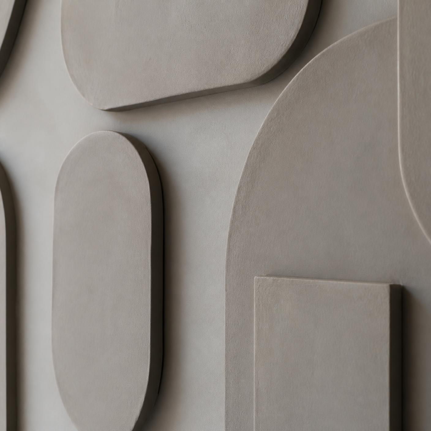
Let light do some of the work
Dimensional signage changes as people move through a space. The face, the edge, and the shadow can make a simple logo or name feel more intentional than a flat graphic. The effect is strongest when the composition has room to breathe and the wall is part of the plan.
A stronger focal point
Raised elements can help a reception wall feel finished without adding more copy.
A clearer brand gesture
A restrained mark or name is easier to take in than a crowded message.
A considered interior detail
Shape, contrast, and the surrounding light all support the character of the workplace.
Make the choices that shape the result
Dimensional office signage is not one fixed object. The best route depends on what the sign must communicate, where it sits, how it is seen, and the options currently presented. This guidance prepares you for those decisions; the existing flow on this page remains the source of truth.
Start with the sign’s job
Reception usually calls for fast recognition. Conference and team spaces lean toward identification and atmosphere. A decorative brand statement is a different job from information people need to find quickly.
Choose the visual profile
A profile that sits closer to the wall tends to feel quieter. A more separated read can create stronger shadow and a more architectural presence. If the flow shown on this page includes directions of that kind, choose with traffic, viewing distance, and light in mind — not a close-up view alone.
Let the wall guide the look
Wall color, texture, seams, furniture, and windows all affect how a sign reads. Whatever materials or finishes are offered should support the contrast and character you want. A real sample or a production review may help where consistency matters.
Plan legibility before detail
View the full composition from the main path of approach. Fine strokes, tight spacing, low contrast, and too much supporting copy all get harder to read at distance.
Room identification is different from decoration. A logo wall or an occupant name is not automatically an accessible permanent room sign. Where a sign is permanent or regulated, review the applicable building and accessibility requirements before finalizing.
Choose the format that matches the job
Use this guide to clarify the sign’s role. It does not confirm offerings and it does not replace site-specific accessibility planning.
| Format to consider | Often fits best when | What it brings | What to plan for |
|---|---|---|---|
| Dimensional office signage | A lobby, reception, conference, or feature-wall identity moment | Physical depth and changing shadow | Viewing distance, wall condition, alignment, and the amount of copy |
| Flat panel signage | More information belongs in one defined area | A structured surface for grouped content | Layout hierarchy and visual weight |
| Wall graphic or lettering | Broad coverage with a low profile is the goal | Scale across a wall without a raised form | Wall condition, contrast, and interior fit |
| Tactile room identification | A permanent room or feature may carry accessibility obligations | Information designed to be found and read by touch | Applicable requirements, placement, character, and Braille decisions |

Make the arrival feel intentional
A visitor understands the tone of a workplace before anyone speaks. Use dimensional office signage where it appears on the natural approach, not simply where a wall happens to be empty. Calm, clear contrast carries farther than competing messages.
Before you finalize the layout
- Walk the approach from the entry, the elevator, and the reception point.
- Check the footprint against doors, furniture, trim, fixtures, and nearby information.
- Notice daylight, overhead light, glare, and shadows through the day.
- Keep the primary mark or name readable before any tagline.
Bring a clearer brief to the artwork review
Good input makes it easier to assess a composition at scale and in location. Follow the upload and artwork-review steps currently shown on this page; this guide simply prepares you, without assuming a workflow or an approval.
Gather your best artwork
Vector files, outlines, or editable paths keep contours clear. Include your highest-quality version along with brand color references.
Photograph and measure the wall
A straight-on wall photo, the usable area, any obstructions, and the approach all help. Notes on texture and condition are useful too.
Describe how it will be viewed
Say whether people see it up close, from an entrance, seated, or walking past — and what the lighting is like at those moments.
Review the composition at real scale
Use the steps available in the current flow on this page to look at orientation, spacing, proportions, and placement before any wall prep or install planning.
If a wall is rough, porous, damaged, newly painted, or otherwise uncertain, have the surface and an appropriate attachment approach evaluated before installation plans are made.
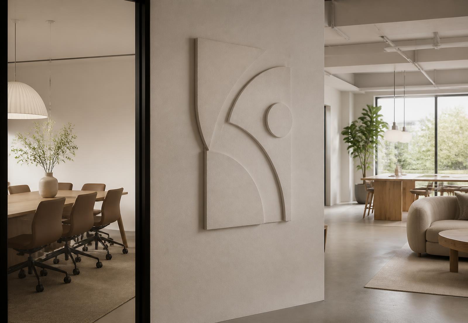
Build around the room, not just the logo
A successful sign considers more than the artwork. The wall is part of the composition, so centerlines, clearances, furniture, light, and sightlines all deserve attention before anything becomes permanent. Multi-part marks and individual letters may benefit from a measured layout or a full-size placement template so balance can be evaluated before final attachment.
A practical rule: decide what the sign needs to say from the doorway, then remove anything that only works close-up.
Questions buyers ask before they commit
What makes signage dimensional?
Individually shaped letters, logos, symbols, or forms have physical depth rather than a flat printed surface. That raised construction can create visible edges and shadow as light moves across the wall.
Is this only for a lobby logo?
No. It can suit a reception feature, a conference room identity, a department or culture wall, or a brand moment elsewhere in the office. Branding can be expressive, while information people need to find quickly should favor clarity.
How do I choose a material or finish?
Start with the wall, the light, the character you want, and the options shown on this page. Clean, warm, reflective, and quieter surfaces each change how a mark reads. Do not assume a specific choice until it appears in the options.
Should the sign sit close to the wall or separated from it?
That choice affects shadow, side visibility, cleaning access, and overall feel. Consider the wall, the viewing distance, foot traffic, and whatever choices are currently presented.
Can it serve as permanent room identification?
Possibly, but decoration is not automatically accessible room identification. Where a sign identifies a permanent room or feature, tactile, Braille, placement, and contrast requirements may apply — review what is applicable before finalizing.
What artwork is most useful?
Vector, outlined, or editable paths preserve contours best. Include your colors, the relationships between logo elements, and any placement directions you already have in mind.
What if the wall is textured or has obstacles?
Texture, seams, paint, tile, glass, masonry, trim, outlets, sprinklers, and furniture all affect placement and attachment. Share wall details, and have anything uncertain evaluated first.
How do I keep it readable?
Assess it from the main approach. Contrast with the wall, spacing, simple forms, and a focused message all matter. Check bright windows and directional light at the times people actually walk through.
Continue planning your space
Ready to plan the wall behind your welcome
Start with the message, the wall, and how people enter. When those decisions are clear, dimensional office signage can feel like part of the workplace — not an afterthought.